Quantcast
Channel: The Kissed Mouth
Viewing all 739 articles
Browse latest View live

Fanny Falls For A Modern World

$
0
0
There was a moment about three years ago that changed my life.  Actually, there were a couple and they happened almost simultaneously.  It was the Autumn of 2010 and I was going into hospital to have some plastic surgery and not feeling particularly cheery about the prospect.  One morning, there in my inbox was an email from an artist called Karen Jones and she had sent me an invitation to the opening of her exhibition entitled 'Muse'...


It doesn't take a genius to recognise Fanny Cornforth in this beautiful image.  Karen had been involved in a project where five Essex artists had produced works inspired by five Essex museum collections.  Karen had taken Rossetti's pencil sketch of Fanny as her inspiration as it belonged to the Beecroft Art Gallery.  It's clear to see how her work followed...

Fanny Cornforth (1850s) D G Rossetti
Beyond the Frame sought to look past the singular image to the story beyond, and for Karen, the story was of Fanny at Southend.  Filled with bittersweetness, a life of regrets and tiny victories, Fanny looks out from the pier and tries to piece together her identity from what her lover has made of her.  The picture of Fanny on the pier, above, contains elements of Found, Fair Rosamund, Belcolore, Lady Lilith, and Bocca Baciata.


Take the dress from Found
The bracelet of Lady Lilith
The shawl of Belcolore
Some beads from Monna Vanna
More beads from Fair Rosamund
The marigolds of Bocca Baciata
In a way this is a reflection of how we, the viewer, construct Fanny from Rossetti's images and how Fanny herself seemed to play up to the part assigned to her by her lover.  Fanny is seen as both Jenny, fond of a kiss and fond of a guinea, and Ophelia, a lost love, wasted by her beloved's fickleness.

Ophelia (2010) Karen Jones
Plunging into the sea, Fanny is surrounded by pansies or violets, which translates as either (or both) faithfulness and loving thoughts.

My Ophelia (2010) Karen Jones
In a graceful swoon, Fanny sinks to the depth of the ocean, the debris of her life floating away.  The letters they exchange drift from her grasp, the vases she stole tumble from her, and her hair and beads spread out.

The Shore (2010)
My favourite of the images has to be The Shore which is accompanied by a passage from 'Jenny': 'Our learned London children know, Poor Jenny, all your mirth and woe; Have seen your lifted silken skirt, Advertise dainties through the dirt.'  The beautiful red of her hair contrasts with the dark sky, and the white foam of the sea acts as a counterpoint to the idea of Jenny displaying herself in the dirty streets of the city.

Ophelia (1 and 2)
What I love about Karen's work around Fanny is how she shows Fanny resisting the stereotypes, how the detritus of Fanny's persona are so loosely attached that the sea and wind can strip them from her.  In the image of her on the pier, Fanny stands before the Margate Steam Packet poster, next to the word 'Venus'.  As she stands, weaving the beads through her fingers, aping her pose when she was Rossetti's only muse, she holds what might be a marigold flower (symbolising jealousy and grief).  She also holds what looks remarkably like a flower designed by William Morris, possibly linking her jealousy with the triangle between Rossetti and William and Jane Morris.

I went to the exhibition at the Beecroft and had my breath taken from me as Karen's work was so very beautiful.  Her tribute to Fanny, her understanding of the person behind the myth of a muse made me quite emotional as I have spent so many years striving for people to see Fanny as more than the jolly tart, a foolish interlude between the two great loves of Rossetti's life.  What I find in Karen's work is a reflection of my own conviction that Fanny is a great goddess, a figure of power and beauty who is nobody's interlude.  For me, Fanny will always be the main event.

To see more of Karen's work, please visit her website and stare in delight and wonder.

Anyone for Tennis?

$
0
0
Predictably, it’s that time of year again when we in this fine nation have to become obsessed with our chances of winning Wimbledon.  Even for people like me who aren’t even that bothered by tennis (I never looked that good in white), the chance that one of our own could be the best at something is rather inspirational.  I think tennis has an added element of old school romance about it too which is totally out of place in the high-tech world it now inhabits.  However, in order to inspire Mr Murray to win, I would like to bring out a few Victorian images of tennis…

A Game of Tennis Francis Sidney Muschamp
I think what surprised me the most about the images I found when searching for Victorian tennis paintings was the overwhelmingly female aspect to them.  You would think very few men actually played until Fred Perry picked up a racket.  Certainly there are men around in these images but I suspect they are there for a chance glimpse at a bit of ankle, as above.  Red tights too, the saucy minx.  Actually she is in my favourite athletic pose, what I call the ‘I’ll sit this one out’ position, yet still holding a piece of equipment to make it look like she’ll spring into action at any moment.  Fat chance.

The Artist’s Sister (1882) Arthur Hacker
I imagine Miss Hacker is wearing her tennis dress, complete with tennis bustle and athletic corset.  At least with a bustle you have somewhere to keep your spare balls.

Brass Buckle (1895)
Particularly lovely is this belt buckle from the end of the Victorian period.  Our sports kits at school was never this lovely.  Had I been allowed to wear this or a bustle I might have wanted to do more.  Navy blue gym knickers inspire no-one.  Well, no-one wearing them anyway.  Moving on.


Tennis Horace Henry Cauty
Also, I think wearing some sort of tight skirt would have given me a good excuse as to why I was so rubbish.  How on earth is she meant to run for the ball when she appears to have been gift-wrapped.  I’m slightly worried by the man behind her who appears to be admiring her bustle.  I love the fact that they seem to have brought a couple of crates of balls, how long do they intend to keep playing?

The Rally John Lavery
Possibly the king of tennis painting is John Lavery who manages to capture the dynamic movement of the players’ swing.  The lady above is a swirl of movement with her racket and arm being mirrored in the swish of her skirts.  I completely believe that she will beat the pants off the slightly nervous gentleman opposite her.

The Tennis Match John Lavery
Mind you, what tennis seems to be used for in paintings is a metaphor, or an excuse, for love.  Maybe because the game contains ‘love’ as one of its terms, a great number of the images are romantic scenes, like the above.  What lady isn’t impressed by a fine mustache and a stripy blazer?  The dog thinks you can do better, love.

The Tennis Party Charles Gere
I won’t go on about how much I love the tempera revival, but Gere’s Tennis Party is a cracking example of why I get all excited by it.  It’s all courtly romance and knightly honour, yet the figures are modern.  The canvas seems so flat with only the merest hint of shadow, but the brightness of the colours strike your eyes in such a way to bring elements forward.  The touches of red bounce across the canvas much like a tennis ball, taking you one way (his jacket, the wine, the folded parasol on the far right), then the other (some flowers at the back, the parasols at the back, the red dress and blush pink window blinds) until you are following colours round the canvas.  Exquisite.

The Rivals: Tea Before Tennis Maude Goodman

Another aspect of the ‘sportsman romance’ is the rather medieval notion that whoever wins the match gets the girl.  Here is a lovely young lady having rather tense tea with two gentlemen who obviously fancy her.  I’ve never considered that you should choose your husband on his hand/eye co-ordination.  Mind you, I’ve known people marry on flimsier pretexts.

An Interested Audience Charles Grierson
Of course, even if there are no men around, getting the girls together is a splendid opportunity to have a good gossip.  The lady in purple has obviously arrived with something other than sport on her mind and is relating some scandal to her interested audience.  I wondered if the girl in the chair, who seems a little removed, is more interested than the others. Do you think that she was involved with the gentleman they are discussing?  I’ve always thought purple to be a rather dangerous colour for some reason and so I think the gossip is doing untold damage to the little group.  There are some discarded gloves (think of The Awakening Conscience) and only one racket…

Memories Fernand Khnoppf
Possibly the strangest tennis picture is Khnoppf’s Memories, with it’s random, racket-holding women, hanging around in a field.  What are they remembering?  Why is the woman in white not holding a racket?  Is she remembering a lost lover?  Do the rackets represent men and she has none?  Does her white dress symbolise her virginity?  So many questions.  I do like a bit of Khnoppf.

A Summer Shower (1883) Edith Hayllar
The Lawn Tennis Season (1881) Mary Hayllar
From the multi-talented Hayllar family come these beauties.  Edith showed a rather more common English tennis scene, with rain and excuse for a bit of flirtation round the corner.  Mary’s window scene is just gorgeous, I especially love the parasol.    It’s in SouthamptonArtGallery, home to the Burne-Jones room, and I always love seeing it when I visit as it is a tiny little gem of a picture.

After a Game of Tennis (1923) Fairlie Harmar
Slightly later than my usual fare, but this last picture is so delightful I couldn’t resist.  I get exhausted just watching the tennis, let alone playing, and so the lady’s state of collapse seems entirely appropriate.  Mind you, she could just be sprawled out on a daybed watching Wimbledon.  That’s the position I usually take when it comes to athletic pursuits.

By the way, if Andy Murray wins Wimbledon, I am entirely taking credit.  He must have seen my post....

Drag Me to Holl!

$
0
0
Come on, I have an entire bevy of Holl/Hell puns, because today the Walker family went to Holl and back and here is my review...

Self Portrait (1863) Frank Holl

In many ways, Frank Holl is much like Thomas Hardy.  Both seem to carry around a reputation of being unrelentingly bleak and miserable doom-pushers, but that reputation is ill-gained in both cases.  Certainly Holl supplied some of the classic knuckle-biters of the Victorian era but Frank Holl: Emerging From the Shadows attempts to give a more complete picture of an artist who packed a great deal into his relatively short life.  The Watts Gallery at Compton has given us the first major retrospective for more than 100 years and it is a brilliant chance to see arguably the best social realist and portrait painter of his generation.

Francis Holl (the artist's Father)
Frank Holl was born in 1845 to a family of notable engravers. Frank entered the Royal Academy at 15 and achieved success and a scholarship to Europe.  Painting scenes of loss and mourning during a period of national grief brought attention, even from the Queen who commissioned images of Cornish fishing life, replete with uncertainty, loss and hardship.

No Tidings From The Sea
This had a splendidly Pre-Raphaelite frame, very reminiscent of Rossetti, which almost distracted me from the sobbing.  For more Cornish Village jollity, may I recommend my post on the subject *Sob!*, but good old Holl didn't limit himself to just Cornish despair and spread it around a bit.  Possibly the highlight of the first room is this little gem...

The Lord Gave and the Lord Hath Taken Away (1868)
Hurrah!  Sorry, anyway, this is a magnificently sob-worthy image where someone is obviously a bit dead and there is a scary vicar round for tea. Also, someone has nicked the poor lass' chair.  There was a great amount of debate over what in God's name is going on here - possibly the death of one or more parents as all the people around the table seem to be of a similar age (apart from Chairless Lil).  There is a lurking crone in the background but I assume she is a servant rather than anyone's Mum.  I bet she's down in the Census as 'Lurking Crone'.

The Wide Wide World
Gosh, I loved this because there is no end of picking that can be done: she's a young widow, she's poor, she's under a sign saying '3rd Class' (nice), and there is a load of ripped up paper near her feet.  Does she want escape but can't afford it?  Has a gust of wind just taken all the receipts out her bag (been there)? Is she just trying to work out how much money she needs for both a Flake and a Diet Coke?  Actually, although it is easy to think she is concerned over her money I think she actually is more worried about the uncertainty that now surrounds her.  I think she's worried that she does have enough money and therefore has no excuse not to go on her way, third class though it is.

Head of a Welsh Fisherwoman
Despite the glorious range of misery on offer, including some rather pretty Seamstresses, stitching their miserable existence into dresses, my favourite picture of the whole lot was this tiny Head of a Welsh Fisherwoman.  She has such a stunning expression, so alive and immediate, that I took to her as much as Holl obviously did.  He used her face in many of his pictures and she was a striking, rather feral-looking lassy, and if this little oil sketch is anything to go by, she had the most beautiful eyes I have ever seen.  Almost distracts you from the oncoming train of dry-sobbing into a bloodstained hankie over an empty cradle by some fisherman's nets. Almost.

1879 was a turning point for Holl.  He did his first serious portrait of an engraver called Samuel Cousins and this started a second career as a very successful portraitist.

Samuel Cousins (1879)
I had completely missed that he did one of my favourite formal portraits from the later Victorian period.  No-one does a grumpy old chap like Holl, take a look at this one...

William Schwenck Gilbert (1886)

As some of you will know (and I will elaborate in a later post, I promise) I am a huge fan of G&S or Gilbert and Sullivan, the creators of some fabulous light operas of the Victorian period.  Arthur Sullivan did the music and William Gilbert did the libretto, or 'the words' (I was using a posh word to impress you).  I have done a fair number of them in my time from Pirates of Penzance (I was the daughter who had a homely face and bad complexion) to an over-excitable fairy in Iolanthe.  I started when I was really quite young so consequently I have quite an impressive lung capacity (I'm just flirting with you now).  Anyhow, William Gilbert always struck me as a bluff old codger full of mad ideas and that's how Holl makes him look.

There is one portrait I found while searching out the images for this which I wish they had used, but of course you can't have all of his portraits and maybe they asked and it wasn't available or maybe they thought they shouldn't pander to me and my problems.  I've put it in here because I have never felt so frightened and rather curious all at once while looking at a picture.  I better not say any more, here it is, make your own mind up and don't judge me.  Only God and my close friends can judge me (because they have to spend time with me, so really, that's their pay off)...

Major General Sir Herbert Stewart (1886)
God, the emails I'll get for that one.  Moving on...

One of the most touching image has to be Gone...

Gone (1877)
In some ways this image brings together a lot of Holl's themes and emotions.  There is a lovely quote next to it in the gallery (excuse me if I took it down wrong, but you'll get the idea) 'Death and Absence differ but in name'.  While not exactly heartwarming, it did strike me as a beautiful way of summing up the predicament of many of the women in Holl's art.  The women in Gone have said goodbye to their husbands at the docks in Liverpool but who knows who will survive before they can be together?  Less pressingly obvious than the perils of being a fisherman, Gone highlights that everyday may bring changes, some temporary, some permanent.  It is rather a poignant that Frank Holl died in 1888 at the age of 43, gone before he really reached his true height of fame.  The idea that someone leaving could well be permanent can also be turned on its head and say that by capturing someone on canvas, they will never die.  The weeping women will always be there, but so will William Gilbert and Holl, looking young and a little belligerent at 18.  In the end, I found that Holl was less about misery but more about the endless pause of eternity where I can look forever at a moment of someone's life.  If you ever think that Holl shows us a moment that is too miserable to enjoy, then think, this is but a moment.

Frank Holl: Emerging From the Shadows is on at the Watts Gallery until 3rd November.

Waiting for you

$
0
0
As a treat this week Mr Walker brought me home the Maas Gallery catalogue to drool over.  He certainly knows how to show a lady a good time.  Whilst flicking and squealing I came across this beauty...

Waiting and Watching Henry Stacy Marks
Something about the blue-green of the gown as she gazes out to sea, the colour of her dress echoing the ocean, seemed so romantic.  The Grey Crowned Cranes give a strange majesty to the image which otherwise would be strongly reminiscent of so many other images of women just waiting and waiting for their lover to return...

Waiting (1854) J E Millais
Possibly the king of all 'waiting' pictures has to be Millais' quiet little picture.  Unprepossessing, but somehow laden with a sort of biding promise, little Annie Miller sits on a stile, apparently as still as the steps, as permanent as the wall.  She may well wait forever, slowly becoming part of the countryside.

Waiting and Watching Robert Fowler
This lady seems to have a more glamorous, classical landscape, warm and draped, with golden tones and pale stone.  If he doesn't arrive, our lady can have a little dip in the pond and then have a snooze in the sunshine.  I don't think she'd be bothered if her erstwhile lover turned up or not.  I may be selling her short, but it doesn't look like life or death to her.

Waiting John McGhie
This one is probably waiting for her man to return from the sea and we all know how well that ends.  I'm not sure about the red of her shirt against the sea, a bit reminiscent of blood for my liking.  I'd like to say that there is no meaning in the empty basket.  Oh dear, she'll be waiting a while, won't she...?

Waiting Jean Beraud
Just to cheer you up, here is another lady, apparently waiting, but if you look to the lamppost up the street, there is a gentleman waiting for her.  I love her tiny little feet and the tiny little flash of colour on the top of her hat.  As she is in black, do we assume she is a widow?  Is she going to meet a man, her new love after bereavement?  As I have been in the sun too long, I wonder if her husband has faked his own death to escape some debt or trouble and so she is going to meet him secretly wearing her fake widow's weaves.  Maybe she has also died and is going to meet her dead husband, who is just up the street, waiting for her.  I need to have a lie down I think...

Waiting for her Escort Cesare Auguste Detti
Moving on to women waiting in the comfort of their own homes, this splendid creature is all swankily dressed and awaiting a fine looking gentleman to take her out.  She looks like an expensively wrapped present, maybe the look she is going for.  She is a decorative doll for her man friend to play with, but you do get an impression that she is no man's passive dolly.  He better be on time or else she will give him hell, I guarantee.

Waiting Ernst Zacharie
Another beautiful woman waits in a stylish interior, but at least this one has a chair for her to sit on.  She is looking at us very directly, is she waiting for us?  She has dropped something, is it a letter?  Is she waiting for an explanation?  Has she been stood up?  So many questions leap out from this sparse composition but shows how many interpretations an be made of the term 'waiting' - who is waiting and for what?

Awaiting an Audience (1886) William Geets
Not all waiting images are vague, some people have a reason to be waiting.  This widow and her young son are awaiting an audience with a man of power, presumably to alleviate her poverty or the suchlike.  Where as our single ladies lounging around in a beautiful room, this woman looks tense and unhappy in her palatial surroundings, while the red guard (possibly guarding a cardinal or some other powerful chap) looks contrasting and nonchalant.   The little boy is the only one who looks positive about their future as he looks towards the room where presumably they will have their meeting with a look of child-like determination.

Waiting to go out James Hayllar
 I include this image because frankly, it scares the pants off me.  The blank-eyed, stout tartan child wants to go out now, take him out.  Go on, I dare you.  Lord knows what will happen if you refuse him.  That's how we lost three nannies before you and they haven't even found the last one.  Moving on...

Waiting for the King's Favourite (1877) Laslett Pott
Now isn't this a lovely image?  A jolly group of gentlemen waiting for a chum to arrive to spring a little surprise on him.  Maybe they have bought him a cake that says 'Congratulations on being the King's Favourite!' and will have a nice slice together like the best of chums.   I have some concerns about the health and safety of greeting your friend with your sword drawn - they out to be careful, someone might get hurt.

Waiting: An English Fireside of 1854-55 (1855) Ford Madox Brown
I finish on this image because like Millais' girl, it shows how, for the Victorians, waiting was a mainly female preoccupation.  It spoke of being the passive one in the relationship, reactive to her lovers beck and call, left hanging while he goes out in the world doing the business of living and dying.  In more than a few of these images of women waiting there is a definite hint that the man has died and they will not know for a while, if at all.  Their future, their lives depend on a man whom they wait for, oblivious to his fate.

By the way, this is my 300th post!  You won't have to wait long for more.  Unlike the doomed Victorian lovers of these poor women, I'll be back at the weekend with a couple of posts.  One is about a painting that the Watts Gallery is trying to save and the other is about how you can come on a pilgrimage.

Worth waiting for...

Join Me on a Pilgrimage!

$
0
0
It's just so hot outside this weekend, I thought I'd bring you a couple of items of Pre-Raphaelite news you can get involved in.  Today's news is about a rather splendid early autumn jolly...


Those lovely people at the National Trust Red House have got together with Curiocity: London Unfolded and created a 13 mile pilgrimage through London, from the historic George Inn at London Bridge all the way to the Arts and Craft shrine that is William Morris' home, the Red House.

The pilgrimage can be done on foot, by bike or on public transport, and it weaves through the glorious green spaces of south-east London, past the wharves of Deptford, the Old Royal Naval College and the ancient oaks of Oxleas Wood.  The pilgrimage concludes in the walled garden at the Red House for a Pilgrim's Party with live folk music from the English Folk Dance and Song Society, guest speakers, a hog roast and local ales.

Pilgrims arrive at The George Inn between 9 and 11am (arrive nice and early if you are walking) and will be issued with a Pilgrims Passport, a route map and a free download of the audioguide for your smartphone (which means I have to learn to use mine). The audioguide has contributions from a wide range of experts including the writer Robert Macfarlane, Anna Mason of the William Morris Gallery, Helen Elletson of the William Morris Society, Chaucer experts Professor Helen Cooper and Professor Barry Windeatt and many more.

Wombats are welcome, I'm going in costume, and there is even a discount rate for redheads, so what more reason do you need?  I'll see you there...

Pre-Raphaelite Pilgrimage
in collaboration with Curiocity
Saturday 7 September 2013
Start: George Inn, Borough High St, 9-11am
Finish: Red House, Bexleyheath, 5-9pm
£20 adult; £16 red heads, NT members and concessions; £14 child; £60 family of four

The Facebook Event Page is here.
Book tickets here

Save Countess Cork!

$
0
0
I'm still hiding from the inordinately hot weather (Fan, fan!  Swoon, swoon!) and so the second post of this weekend is about saving a beautiful painting from being lost from public view.  It's something we can do from indoors, so it is a winner in my book.


Inside the Watts Gallery at Compton, near Guildford

You lot obviously know how much I love the Watts Gallery in Surrey.  Where else can you see a giant Tennyson?  And their refurbishment has made them such a splendid, world class museum, the perfect home for the beautiful collection.  Anyway, they are presently trying to raise money to save a full-length portrait of Countess Cork by G F Watts from being sold into a private collection, and therefore not publicly accessible.

Countess Cork (c.1860) G F Watts
The painting was commissioned around 1860, when Watts was executing some of his most lush and elegant society portraits.  Despite having a lot of his later portraits, the Gallery don't have an example of his work from 1860 and this is such a splendid piece it would be marvellous to bring it home to the Gallery.


The Countess, Lady Emily Charlotte de Burgh is shown at her Somerset estate, aged around 32 years old.  In her hand is a peacock fan, an early aesthetic motif.  I think the truly astonishing part of the work has to be the foaming lace at the cuffs, painted in such a way that you can almost feel how soft and translucent those waves are, against the rich darkness of her velvet dress.  I think it's interesting that she had had four of her seven children by this point, but not a son yet (Charles came along in 1861 and Robert in 1864).  It's interesting to wonder, as the exact date of the painting is not known, whether it might be painted to celebrate the birth of the son and heir in 1861.  It is such a lavish, such a beautiful portrait, it feels like it was created for a special reason.

The Countess is being shown at the Watts for a limited time, so you have the chance to go and see her in all her finery before donating if you wish, but it would be lovely to help such a wonderful gallery to purchase this work so we can all enjoy it forever.

To read about the Watts campaign to raise money for the Countess, go here.

To give money to the Watts Gallery's Fund for Countess Cork, please go here.


Lowry's Love of a Stunner

$
0
0
You'd be right to say that I'm not really very excited by the current exhibition of L S Lowry's work, entitled 'Lowry and the Painting of Modern Life', showing in Manchester until October.  However, I am interested in Mr Lowry...


Despite my ambivalence to matchstick men and industrial landscapes, I have followed the press coverage of the exhibition with interest because of L S Lowry's dark and shameful secret.  He loved Pre-Raphaelite art. Shocking.  What's a nice modern artist like Lowry doing with a bluff old Victorian like Rossetti?

Bandstand, Peel Park (1928)
If you think about Lowry's age and where he came from, then his love of the Pre-Raphaelites is less amazing. Born in 1887, he grew up among the ideas of William Morris and Edward Burne-Jones, artists who were held in esteem at the evening art class he attended.  He visited the 1911 Pre-Raphaelite exhibition in Manchester and then another smaller one of just Rossetti and Ford Madox Brown's portraits in 1920, together with the Brown murals in the Town Hall.  He claimed, possibly apocryphally, that as a small boy he was taken to see Brown paint them (he would have been 5 years old at the time). That was it for him.  His love for Brown and Rossetti never wavered for the rest of his life.

Portrait of a woman L S Lowry
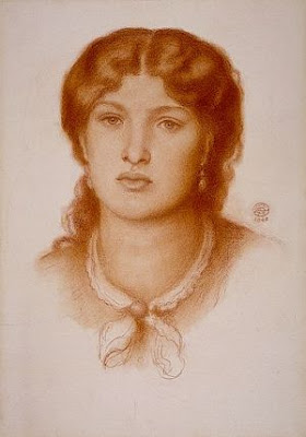
Of course, Lowry's work was more than just those matchstick figures and factories and a look at some of his portraits shows a softer, more 'Victorian' sensibility to some of his work.  Lowry's desire to purchase his own Rossetti picture came after a stay in a house owned by a friend of the Agnew family (art dealers connected to the Pre-Raphaelites).  There he saw a drawing of Elizabeth Siddal.  Ironically, Lowry never really liked the pictures Rossetti did of his wife, preferring other, more fleshy goddesses...

Possible Study for Sibylla Palmifera (1865) D G Rossetti
Lowry bought his first Rossetti picture in 1953.  Although this was a possible study for Sibylla Palmifera, it isn't Alexa Wilding (who sat for the final picture) but Fanny Cornforth.  Lowry wasn't keen on her 'goitrous neck' but felt the drawing had 'a lot of vitality' and hung her for a while in his bedroom.  It was after I read that I began to really like Lowry...

The Laurel (1862-4)
Portrait of a Lady (1860s)
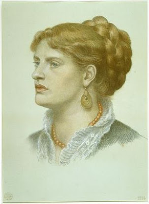
Lowry followed up his initial Rossetti purchase with two more, two years later.  He purchased The Laurel, a portrait of Agnes Manetti or Ada Vernon from the mid 1860s.  He purchased it as Portrait of a Lady Seated Holding a Flower and apparently he liked the hands but felt the mouth was rather hard.  The rather more enigmatic Portrait of a Lady was a less successful picture, and reminded him of Fuseli (he didn't like Fuseli).  He ended up hiding it under his bed as he did not like it enough to see it on a regular basis.  I would argue that it was again Fanny, but it isn't a very good image of her, the eyes are uneven and she is doing something undignified with her right hand.  Possibly best she went under the bed.

Lowry's possession of Rossetti ladies gained momentum in the 1960s as he was establishing himself as a successful artist.  He purchased this image of Alexa Wilding in 1960...

Alexa Wilding (1873)
I hadn't noticed that her pose is a reverse of Reverie.  Lowry hung this image downstairs in his house, on more 'public' show, over his sideboard.  It certainly paved the way for one of the most important purchases of his collection...

Proserpine (sixth version 1873-77)
My apologies if the version of Proserpine isn't the right version, it's a nightmare trying to sort one from another.  Lowry bought this oil in November 1964 and he considered it one of Rossetti finest painting, second only to Astarte Syriaca which he had admired in Manchester (as have I, it's stunning).  He hung her on the stairs, but then moved her, propping her against his wardrobe because he didn't like passing her, possibly feeling it to be unlucky.  Interesting note: the copy of Proserpine currently up for auction was bought by a friend of Lowry's after they admired the artist's copy.

Morning Music (1864)
Head of a Girl (1866)
Not everything he purchased was displayed.  Morning Music and the Head of a Girl were bought but hung briefly, if at all.  They, like others, ended up under his bed.  One of the problems may have been that Lowry often didn't go to the sales himself but had an agent bidding for him.  I wonder how much he felt conflicted about his love of such unfashionable art.  Head of a Girl is rather lovely, I would guess a possible image of Alexa, but he didn't let her see the light for long.

Tales of Sorrentino (c.1843)
Design for Benedict and Beatrice (1850)
Again, Tales of Sorrentino and Benedict and Beatrice were both bought and not displayed.  Benedict and Beatrice may have been seen by Lowry when it was displayed in the 1911 exhibition, and may have been purchased by him for sentimental reasons.  Bought in 1966 and 1967 respectively, they seem to have been incidental to the main thrust of his collection, which was the Stunners...

The Return of Tibullus to Delia (1867 watercolour replica)
The figure of Delia is identified as Fanny Cornforth, rather than Lizzie Siddal (who famously posed for the sketch, arguably used for Beata Beatrix) and it is obviously a different figure, chomping on her hair while her husband charges on in.  Lowry liked the figure of the old woman, stretching between different instruments, attempting to become a one-woman band.  Whatever she's playing doesn't seem to be disturbing the cat...

Annie Miller (1860)
One of his favourite pictures which always hung downstairs was this sketch of Annie Miller.  He hung her opposite his armchair so he would see her often.  It was the 'uninhibited passion' of Rossetti that attracted him and he felt this was most vividly displayed in his pictures of women.  The way he described them seems very odd, if you take into account how much he liked them: 'They're very queer creatures and I like him for it...What he puts into the individual is all him, not the individual, they're probably very ordinary people'.  In 1961 he said 'I don't like his women at all, but they fascinate me, like a snake.  That's why I always buy Rossetti whenever I can.  His women are really rather horrible'.

Aspecta Medusa (1867)
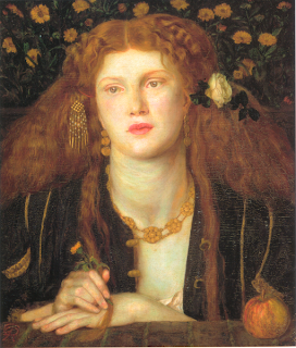
I would say that Lowry's overwhelming love affair was split between two women.  The focus of his collecting includes images of Alexa, while he admired the oils that included her that he saw in Manchester (possibly from the collection of Frederic Leyland, Alexa's biggest fan) and she definitely fits the bill of his 'horrible woman' in the subjects she portrayed.  She was Rossetti's cool, detached goddess, an evil that would ignore you as your punishment, more concerned with her own perfection.  The same could not be said of Lowry's other favourite...

Mrs William Morris (1870)
For Lowry, Jane Morris seems to be the perfect Stunner.  Despite his admitted 'revulsion' at the images, he had a fondness for her as he experienced her through the more 'portrait' aspects of Rossetti's art.  He hung this sketch in his bedroom with his Burne-Jones sketch of a woman, and always felt that there was more emotion in Jane's face than in Burne-Jones' model.

Pandora (1869)
Reverie (1868)
I always had a weakness for Rossetti chalks and it appears I'm in good company.  Lowry bought both of these from The Stone Gallery in Newcastle upon Tyne and remained fond of them until the end of his life.  Both hung in his bedroom and he found them alluring and fascinating.  Considering Lowry's very complex relationship to Rossetti's work it seems unsurprising that he would be drawn to the artist's most 'complex' muse, a punishing, reflective, sorrowful goddess, who needs you but you are unable to reach.

Lowry at the exhibition of his personal collection, 1977
Lowry said that although he admired the work of Ford Madox Brown above all artists, definitely above Rossetti, he liked Rossetti on a personal level and felt a connection to the man and his art.  It is impossible to see a direct link between Lowry's images of the industrial landscape of the North West of England and a painting such as Proserpine but then I read and enjoy many books that I would have no intention of writing myself.  Maybe Lowry felt that Rossetti alone could make those images, that there was a special interplay between muse and artist that would be pointless to reproduce, so he had no interest in painting in either the style or the subject.  In the end, Lowry claimed that Rossetti was the only artist whose work he really wanted to own (despite his collection of many other works).  Maybe that seeming conflict between Lowry's work and Rossetti's was one of the allures that drew him to collect.

The Tate exhibition runs until 20th October and further details can be found here.
Further information about L S Lowry, including an exhibition on previously unseen work, can be found here.

Your Favourite Fanny...

$
0
0
Hello Chaps!  You may or may not know that Sunday 8th September is Pre-Raphaelite Brotherhood Day (or #PRBDay for Tweeters) and there will be all manner of shenanigans this year as it is also 25th Anniversary of the Pre-Raphaelite Society here in Great Britain!  Goodness, cake all round!  Anyway, last year there was a poll of people's favourite Pre-Raphaelite painting on Twitter, but I though it might be fun to have a little vote on here.  Obviously, I want to hold a Fanny Vote.


Over the next few days I will be posting up some pictures of Fanny Cornforth and I'd like you to either post your vote here, on the Stunner's Boudoir page on Facebook, or by email (stonellwalker@googlemail.com) and on Sunday 8th September I shall reveal your favourite images of Madam Cornforth!  Such larks!

Okay, today we shall start with the oil and watercolour paintings of Fanny.  Here are a few suggestions but feel free to shout out some more.  Any you suggest that aren't illustrated here I'll pop up on the Stunner's Boudoir!

Actually, there aren't that many oil paintings of Fanny as her reign as Rossetti's sole muse was sadly very short.  She appeared first as the fallen woman in Found...

Found (1850s unfinished)
The figures were finished, but the rest of the canvas was neglected as Rossetti fell out of love with the subject.  After all, why should the prostitute feel any shame when the woman who modelled for her didn't seem to.  Is this a more realistic portrait then?

Bocca Baciata (1859)
Ah, the Kissed Mouth!  There is a girl who is fond of a kiss and fond of a guinea.  While this is often thought to be a 'portrait', it really isn't, it's another part that she played in Rossetti's mind.  Here we have Fanny as the luxurious, sexual equal, constantly waiting to be embraced.

I think possibly my favourite oil painting of Fanny is the rare oil portrait...

Fanny Cornforth (1862)

It has the look of a fire-lit portrait, as if he painted her one evening as they sat by the fireside and she thought about the future.  I love her expression, distracted, hidden, absorbed.  She looks like she is already worrying about her lover but he is too blind to see it, even as he paints her.

Fazio's Mistress or Aurelia (1863)

Despite my love of the little circle portrait, it doesn't mean that I don't love his other major oils of Fanny between 1860 and 1865.  Fazio's Mistress is such a 'senior' work, by which I mean it looks like there is no doubt in Rossetti's eye that this was what he imagined and wanted.  Fanny inhabits a role of certainty, binding her hair into plaits as surely as she binds her lover to her.  All is luxury and excess, all is fantasy and warmth.

Woman Combing her Hair (1864)
I didn't realise that Woman Combing her Hair is often known as Fazio's Mistress as well.  I link it more readily with Lady Lilith in my mind, but all are images of women preparing their hair for the male gaze.  I love the colour of Fanny's hair in the watercolour of her combing her hair, so rich and gingery, clashing with the red at her neck.  It is a picture of excess, but has a tension rather than the relax of luxury.  She seems to have almost too much hair, trapped under her elbow and catching in the comb.  The woman seems to shy back but is trapped in the small space, cluttered by bric-a-brac and her own physical opulence.

Fair Rosamund (1861)

Talking of opulence, this is a painting I would merrily steal.  It is one of my favourites yet I often overlook it when talking of Fanny's career as it is tucked away in the period of the Rossetti marriage.  At first glance it is a traditional waiting maiden, one of Rossetti's many women who seem to exist to loiter.  Look closer and the flush on her cheek and chest is almost indecent.  She is all pink and blush, feeling the excitement grow as the cord her lover is following tightens.  The green glass around her highlights that rosy tint, and all of her is blood and heat.  Look at the roses on her dress and how they reflect the one caught in her hair.  Exquisite!

The Blue Bower (1865)

Last but not least is the painting it is impossible to reproduce.  The Blue Bower is a riot of blue and green, sharp and fresh, and I've never seen Fanny's skin look so clear and pale, like china.  The use of flowers in the canvas drives me to plant up my garden with cornflowers and passion flowers and it is at once cheeky and classy.  Plus she has one of the most delicious hairclips I have ever seen.  This is Fanny's swan-song from Rossetti's eye, neglected back to a 'practice muse' after this, but it is a hell of a finale.

Right then, I need you to vote for your favourite oil, either on this page, on the Stunner's Boudoir on Facebook (I will have a link to this post and you can leave comments below it) or you can email me direct with your vote or if you have any other suggestions.  Tomorrow will be pencil and pen drawings and Wednesday will be chalks, and you have until Saturday 7th September to cast your vote in all three categories.  Your favourite pictures will be revealed on PRB Day on the 8th!

For Fanny's sake, get voting!

Your Favourite Fanny: Pencil, Pen and Ink

$
0
0
Hello again, and we're on Day Two of the Fanny Vote, and today I'd like your views on the sketches of Madam Cornforth.  Rossetti was constantly sketching the women he loved, not only the glamorous portraits, but sometimes in more domestic scenes.  There are countless images of Fanny sewing, eating, or sleeping, a still life of his love as she occupied the private corners of his life.  Unlike yesterday when I gave you all the oils of Fanny, I have only a selection of images today, so if you have a favourite that I haven't suggested, feel free to post it here (linking to the Rossetti Archive entry of it, if possible).  Off we go again then...

Female Figure for Found (1854)
Back to the start of Fanny's career and I think this is arguably the picture that Rossetti drew the evening/morning he took Fanny back to his studio and put her head against the wall for 'the calf picture'.  Unlike the more dramatic expression of the finished oil, this woman has a look of exhaustion and sorrow rather than crippling shame.  She is turning away with sadness, a more realistic emotion than in later versions.  It's understandable that she would be sad, whatever the moral stance, if she met again with her lost love, knowing that there would be no chance of reconciliation.  I'd love to know how far the couple worked together on her expression, how much of the scenario he described to her, but her face in this drawing is beautiful and touching.

Sketch for The Blue Bower (1863-5)
From one end of Fanny's career to the other, this is a study for the final oil painting she appeared in, The Blue Bower.  Much is made of why Rossetti stopped using Fanny, and the main thrust of the argument is that she had grown unattractive.  Here is a sketch from that time and her beauty is still very much in evidence in my opinion.  She has a very 'matter-of-fact' expression as if to say 'Of course I'm beautiful! And?' which I think says something of Fanny's character in the 1860s.  The painting was conceived in around 1863, at the pinnacle of Fanny's reign, and she couldn't have been more secure.  I love the fact that Boyce owned this picture and the other sketches done for the oil; he had known her for around 10 years at this point, and he too still found her beautiful.  I like to think this was one of the happiest periods of her life when she was the goddess they all adored.

Fanny Cornforth (1862)
Talking of goddesses, this drawing always reminds me of the story where Rossetti was describing Fanny's finer points to a friend, pointing to her various attributes as she reclined on the sofa.  When he had finished Fanny merely laughed and told him not to be so silly.  She may have looked like a goddess but her feet were firmly placed on the ground.

Fanny Cornforth (1859)
I came to this picture late, discovering it in Maria Benedetti's catalogue of Rossetti's work (bought because I was never going to be able to afford the Surtees volumes).  Part of me finds it hard to imagine it is actually Fanny as it is so different to the rest of his images of her, but there are a couple of other pictures which resemble it, one of which is a pastel I'll feature tomorrow.  Part of me thinks it looks completely unlike Rossetti's normal work, I mean look at the lips!  However, she has the ivory tower of a neck that marks her as a Stunner.  It is a picture that redefines 'delicate', not a word that is usually used to describe Fanny.

Fanny Cornforth (1867)
Again, a picture I wasn't familiar with until recently, this pencil, pen and ink sketch is from after the point when Fanny ceased to be Rossetti's muse.  After 1865 it was thought that any images produced of her were vanity pictures for her to sell, but this seems to be a portrait drawn for a specific purpose.  Possibly a sketch for Monna Vanna (it has the same luxurious, Venetian feel) or a painting that was abandoned in his obsession with Jane Morris, I think this image shows reason to doubt the convenient narrative supplied in some art histories.  As I always say, never stop asking questions.

The Backgammon Players (1861) Edward Burne-Jones
Finally today, here is a sketch by Ned Burne-Jones, done during Fanny's hiatus with Rossetti due to his marriage.  I think Burne-Jones catches Fanny's beauty perfectly, and his level of finish is astonishing.  The Fanny he shows us here is straight from Rossetti: the thick white neck, the folds of fabric and the great tumble of hair.  Her companion is considering the game, but you feel that Fanny is considering the future and another man.

Right then, same drill as yesterday, leave your votes or suggestions below, at The Stunner's Boudoir on Facebook or direct to me at stonellwalker@googlemail.com.  Tomorrow I'll give you the third and last set of images to vote on, those delicious pastels and charming chalks that I always rave about.

See you tomorrow!

Your Favourite Fanny: Perfect Pastels and Charming Chalks

$
0
0
Here we go with the last part!  Remember I want you to give me your votes on all three sections: the oils, the drawings and today's category, the chalk pictures of Fanny Cornforth.

In many ways, this has to be the section I have looked forward to the most because I think Rossetti was at his best when he was using pastels.  Unfortunately, his chalk pictures tended to coincide with failures in his health so I wonder if the medium held negative connotations for him?  He certainly could create a stunning quantity of beauty with those powdery little sticks...

Fair Rosamund (1861)
While I adore the oil of this image, the pastel is delicious.  Without all the clever detail and colour, Fanny stands before us, unadorned and leaning against a wall, awaiting her turn.  I love the way her hair is pressed up on the right-hand side as she rests against it.  The simplicity of the image makes it special.  It is a woman waiting her turn with her lover, which, in 1861, was exactly what Fanny was.

Lady Lilith (1866)
Despite the limited palette of colour used by Rossetti in his chalks, they normally have a very naturalistic look about them, unlike this striking rendering of Lady Lilith, aflame in red.  Somewhere between 'Woman Combing Her Hair' and 'Lady Lilith', this picture has a domestic feel, unlike the finished oil of the punishing devil-woman.  She is lost in thought, lost in her brushing and preparations for you and means you no harm at all.  The final, finished Lady Lilith looks like she will eat you alive if she can be bothered to look away from her own reflection for a few minutes.

Fanny Cornforth (1868)
When people talk about chalks and Fanny, they tend to mean this image.  It is possibly the most famous of his chalk pictures of Fanny and is very pretty indeed.  I have read many times how flattering this image is, as if by 1868 Fanny couldn't be pretty still, being all fat and knocking on a bit (at early 30s) and how he was buying her silence with pictures for her to sell.  What nonsense and how insulting to reduce the relationship of two people to such a crude smudge.  I think it is a warm and comforting image of someone he was extremely fond of.

Woman with a Fan (1870)
Seated in a similar fashion to Lady Lilith, here we have the glorious Fanny with a fan (pun-tastic!) looking magnificent.  I always imagine her in a white frock, possibly due to her being described in one in William Allingham's Diary, chasing the peacocks in Rossetti's back garden.  She looks out at us with challenge and I often think she is saying 'Go on, just try and shift me!'  This is a picture of Fanny, the adversary and I don't fancy the chances of anyone coming up against her.

Fanny Cornforth (1874)

Obviously I'm going to finish with the trio of chalks from 1874 because they are brilliant and I can't just feature just one.  Firstly, we have Fanny in her frilly lace collar, looking respectable.  That great wheel of hair plaited over her head gets me every time.  It's such a chunky braid, you can almost feel the weight of it, crowning her.

Fanny Cornforth (1874)
I love this picture of her, looking to the other side, her expression sharp.  She was still so beautiful, even if he had romanticised her (as he did with all the women).  The thing I love about the final chalks is that they were life size, if not bigger, so when you see them, it's like you are looking at Fanny and she is looking back.  Again, it is said that he drew these for her to sell, but she kept them for a long time so I doubt that to be the whole story.

Fanny Cornforth (1874)
If I had to declare a favourite, it might be this one, where she is nudey and pink.  Again her incredible hair is what draws me to her, just the sheer quantity of it.  At this point in their relationship, she had reclaimed him once more from his 'affair' with Jane, but she had won him back in a sorry state.  Rather than these being a pay-off, I wonder if they are a thank you for being there when he limped home.  His eyes were failing him, his mind was failing him, but she never would.

Right then, vote on, my Chums.  You can leave your comments here, on The Stunner's Boudoir on Facebook, or direct to me at stonellwalker@googlemail.com.  All in all, I need your vote for an oil, a sketch and a pastel (or any combination you feel like).  I have been mightily impressed with your response so far, so keep them coming.  I will reveal your favourites on PRB Day in September, so you have plenty of time...

Review: The Beginning of the World

$
0
0
Good Morning, on this fine Sunday morning!  It seems appropriate that I'm reviewing a book about Mr God this morning, but fear not (should you fear such things, not sure why) this is a Pre-Raphaelite work of loveliness.  Today I am reviewing The Beginning of the World by Edward Burne-Jones.


People who know me will know I own far too many Bibles.  It's true, in our house we have double-figures of religious texts, and every time an elderly relative dies, I tend to get their Bible and book of Common Prayer. I love them, especially the ones with illustrations and so when I was sent this book to review I was delighted.  The idea was that the Kelmscott Press would print a Bible (can you image how amazing that would be?) and so Edward Burne-Jones started work on some designs that would illustrate it.  Sadly both he and Morris died before the book could be completed, so Georgiana published what had been created in 1902.
The Creation
In this reproduction of the 1902 edition, the publishers have left in Georgiana's introduction which states that the illustrations were made for 'Mr Mackail's Biblia Innocentium' due to be published by the Kelmscott Press, and containing 200 pictures.  However only 25 were produced (from Genesis) and so Georgiana gathered them with the appropriate text passages.

Things go wrong in the Garden of Eden
It's not a long book, only 23 pages long, and illustrated in black and white woodcuts throughout but it is charming and elegant in its interpretation of the scenes at the beginning of the Bible.  Each little image is filled with detail, scales on the devilish serpent, apples on the trees and all of it is filled with Burne-Jones brilliance.
Expulsion from Eden
The text covers the story from the Creation to Cain and Abel.  As a side note, there are twins who live round here called Cain and Mabel.  That, my friends, is a work of genius and I salute those parents. Anyway, Burne-Jones' illustrations are as beautiful as you would imagine.  Look at the last ones of the ill-fated brothers...

Cain and Abel
If you are a fan of Burne-Jones' figures then you'll love this, as all of them are elegant and perfect, like they always are.  I like that he never shies away from violence, and never trivialises it, but lends it a sort of shocking beauty.  I find this to be true of his other work, such as the Perseus story, but look at the figures of the brothers above.  Look at the way that Abel reaches for his brother's legs in pleading, but Cain's hand presses his brother's head down, with the other arm raised in preparation to strike.

The book is priced £12.99, which may seem a lot for such a slight book, but it is a chance to see a good reproduction of the work, in A4 sized pages.  The publishers Pallas Athene have taken trouble to present this work (and many others) in an attractive, accessible way.  More Burne-Jones in our lives is always a good thing...

To buy this from Amazon go here (UK) or here (US)

To see what else the good people at Pallas Athene have in store go here.

Like Leaves in Wintry Weather

$
0
0
I love painting that are so resplendent in detail that new narratives sneak out and get you when you least expect it.  Even the most familiar picture can be re-read in a different way if you think about a detail in a new light.  And it's fun!

The Awakening Conscience (1853) William Holman Hunt
One of the most famous Pre-Raphaelite pictures, certainly the most famous done by William Holman Hunt, this will be a very familiar painting to you.  Conceived to hang together with The Light of the World, it is the moral and spiritual awakening of a woman whose morals are in dire need of a good awakening.  She rises from the lap of her seducer when she hears Jesus at the door and is saved (or not, depending on how you read the repainting of her expression).  The room in which she stands is overflowing with meaning, from the discarded glove (oh dear), the cat toying with the bird (oh deary me) to the unraveling wool (lawks, that's not ending well) all spelling doom for the woman if she doesn't see the error of her ways and embrace Mr Jesus and the way of the open window.  All that is hammered home by the imagery of the frame, marigolds and bells representing sorrow and warning...


Oh she is doomed!  She is saved!  She is doomed and saved (Soomed? Daved?) But what of the man?
In all of the interpretation, the man is rarely mentioned beyond his role in the downfall of our petticoated prossie here.  The reason I started thinking about him is because of this...


On the piano is a piece of music entitled 'Oft in the Stilly Night', from the 'knuckle-biting' section of the music shop. It is a poem by Thomas Moore set to music and appropriately speaks of regrets.  The traditional reading of the picture is that the woman is so touched by the words that she has an epiphany that her life is ruining her.  Here are some lyrics: 'Oft, in the stilly night, Ere slumber's chain has bound me, Fond memory brings the light, Of other days around me'.  So far so good, the poem says that at night the poet remembers happier, simpler times.  Like the woman in John Roddam Spencer Stanhope's twin works Thoughts of the Past and Robins of Modern Times, the woman is thinking back to her childhood before/when it all went horribly wrong...

Bugger.
Come on, it's not like I'm going to end up as a prossie...


Well, Oft in the Stilly Night reminds the awakened woman of her care-free childhood, and her predicament and loss is brought home to her.  Or is it?  Look at the next lines of the song...


The smiles, the tears,
Of boyhood's years,
The words of love then spoken;
The eyes that shone,
Now dimm'd and gone,
The cheerful hearts now broken!

The song is about a man who remembers his past at night, his happy past that draws attention to how miserable his current state is.  What if the person we should be looking at is the man, not the woman?

The Cad!
Should we consider his feelings in all this?  He appears to be the archetypal cad, just short of a moustache-twist to make him complete.  He is literally keeping her down (in his lap) but she has literally broken free of him and seen the light.  Literally.  A lot of this is literal, which is odd for such a symbolic image.  If the music applies to him, what are we being told?

My inner turmoil shocker!
The second verse of the poem is less cosy and smiley than the first and brings home a slightly more disturbing feeling than the rose-tinted start.  The narrator speaks of remembering his friends who have all fallen 'like leaves in wintry weather', although it is arguably vague if they are dead or if they have just left him, fallen away from him.  I'm going to assume dead, it's more fun.   He continues that he has been feeling as if he is alone in a banqueting hall, 'Whose lights are fled,Whose garlands dead, And all but he departed!'  The imagery of a banqueting hall with garlands is quite lavish and bacchanalian but it seems our chap has hung on too long, stayed there far beyond what is appropriate, what is good for him.  He has become the last loser at the party which ended twenty years ago (rather like Simon Pegg's character in The World's End).

The perils of trying to finish a pub crawl twenty two years too late...
Maybe, just maybe the Conscience that needs awakening is our chap, sitting at his piano.  Bear with me.  He has his mistress, he has his shag-pad in St John's Wood, but isn't it time he actually started behaving responsibly and less soul-destroying?  He is about to be left by his semi-naked squeeze, he is playing on while his own personal Titanic sinks but it isn't an act of bravery, more one of oblivion or sheer bloody denial.  Is he suddenly aware that he is alone in his banqueting hall?  The term for sleep in the song is 'slumber's chain' which doesn't have a comforting ring if you ask me.  He is 'bound' by slumbers chain, unable to escape from all the rosy memories of the past, an odd juxtaposition of the good memories and the terrible claustrophobia of the night.  Even if the woman had a look of horror on her face, I think that the creature who is damned in the picture is the man, and he knows it.  And he'll be thinking about it at night.  Alone.

It may not be what the artist intended but I bet you won't look at the picture the same again.  All together now... 'Oft, in the stilly night, Ere sluimber's chain has bound me...'


Wombat Delight at The Red House

$
0
0
Ah, Wombat Friday!  The chance every week to have a bit of cake, look at a book and ponder the life of a furry chum.  I am an enthusiastic participant in Wombat Friday and so is my wombat, Fanny...


Since its beginnings earlier this year Wombat Friday (#wombatfriday on Twitter) has be a delicious diversion at the end of every week amongst the charming folk of the Pre-Raphaelite community.  Imagine how ecstatic we were when the National Trust's Red House joined in...


I have made the journey to Bexleyheath before but this Friday I had a very special reason.  It was the first Wombat Friday that the Red House had with their Wombat Trail.  God bless you Red House!  Yes, all this summer holiday, the good folk of the Red House are hosting a bevy of wombats and their own special brand of madness.  How could we resist?


Time to get a bit heritage-nerd for you, but the reason I like the Wombat Trail so much is that it worked on a couple of levels.  As you go in, they give the young (or not so young) wombateer a trail sheet.  This is a folded A3 (4 sides) sheet.  The inside has the wombat trail which briefly describes where various wombats (and other things) are hiding in the house and a visual clue.  The outside has more 'text' based info on Morris, the house and wombats which manages to be accessible for children and factual enough for adults.  It is also rather glorious to look at...

The outside title - the outside of the leaflet contains information
The inside contains jolly wombat larks!
Lily-Rose and Fanny the Wombat seized the sheet and away we went.  Miss Walker is used to visiting various historic houses and museums but this gave her purpose as Miss Holman (lady adventurix and resting ninja) and I were dragged from room to room with squeals of delight at the discoveries.

Wombat in the fireplace!
There were all over the place, in the furniture, on top of the tapestries, both in furry and pictorial form...

Lily finds Janey and Top
'But how did he get up there...?'
We had an absolute ball.  While Lily searched for wombats Miss Holman and I looked at the work that has been done (and continues to be done) around the building.  It's been 10 years since the Trust acquired the house and the work they have done even in the last few years since we last visited is amazing.

Part of an uncovered mural, possibly by Elizabeth Siddal
The beautiful mural of The Wedding Feast
Look at what is under the chair at the wedding feast...could that possibly be a wombat?  While in form it reminds me of the dog in Isabella by Millais (and the little dog in La Belle Iseult by Morris, as the room guide reminded me) the face has a definitely wombattish look, with those familiar little triangular ears.  Painted during the blissful early 1860s, this mural by Burne-Jones definitely reminds us that for a moment the Pre-Raphaelites lived in a sort of paradise.  The motto in the newly revealed  lower section of flowers and coloured band reads 'qui bien aime tard oublie' which translates as 'He who loves best forgets last'.


After all the dashing around there was no chance I was leaving without Miss Walker visiting the gift shop and by the time I reached her (I had paused to talk to the lovely James Breslin, House and Garden Manager, about wombats, obviously) she and a wombat, appropriately named 'Top', had made friends and was coming home with us.  To be fair I added to the bill with one of their gorgeous pewter 'Si Je Puis' badges and an apple tree.  Everyone left happy.

On a personal note I'd like to thank every single member of staff and volunteers we met yesterday.  As most of you who follow this blog will know, Lily-Rose is severely visually impaired because of Albinism.  This means that not only is her eyesight on the 'dodgy' end of the scale but she has added excitement with nystagmus (rapid uncontrolled eye movement) which means what sight she has can be disrupted into virtual blindness at any time especially when she feels under pressure or uncertain of her surroundings.  Every room guide we met made every effort to engage with her in her hunt for wombats and helped her find them. |She loved every minute.

Lily and Top
The Red House are running the trails every single day of the holidays, not just Fridays, and if you have kids and can get there, I can't recommend it enough!

Visitor information for the Red House can be found here.

A Palace of Memory, A Face of Her Own

$
0
0

Although I have known her for a while now, I have recently had the pleasure of working a little more deeply with the Dutch artist Margje Bijl.  Many of you will be familiar with her uncanny work around the visual culture of Jane Morris, uniquely expressed through her own form, her own beauty.  Margje is more than just a reflection of a Stunner, she is a walking work of art, an exploration, a reincarnation, all of this and more.  She physically explores what it means to be Jane, to be herself, and I find her work inspiring and breath-taking.  It is with delight that I can bring you some of Margje's work today, so I will hand you over to Margje...

Rossetti's studio
Christina Rossetti
"The walls of the studio of Pre-Raphaelite artist Dante Gabriel Rossetti were covered with his paintings and drawings depicting his muse Jane Morris. By a stretch of the imagination he might have fantasized about a device which would enable future generations to access his art, poetry and even his private correspondence with Janey. But never would he have been able to foresee a future in which a female artist, bearing an uncanny resemblance to his beloved muse, would put this same device to good use in her studio. Rossetti's imagination would probably spiral out of control if he could witness this double combining her own image with the photographs of Jane Morris, which he himself had commissioned to be taken in his own studio home and garden.

From Time to Time She Stole a Glance, 2009
Original photographs by Sipco Feenstra 
and John Robert Parsons
Sunlit studio, 2012 
Original photographs by Sipco Feenstra 
and John Robert Parsons
From her chair, bathed in the device's blue glow, Jane’s double would even be able, in her thoughts, to stroll along his street to view the front of his home from several angles. Another window of this device would bring his world even closer by allowing her to book a journey to his country. Eventually, she would appear upon his doorstep in person, accompanied by her lover at that time, a photographer.

In her hand she would carry a portable version of the device and would use it to repeat the words Rossetti himself once wrote: '...The photographer is coming at eleven on Wednesday. So I'll expect you as early as you can manage...'

On his doorstep, 2011
photograph by Hein van Liempd
Cheyne Walk
A new pattern for the Empress, 2011
photograph by Hein van Liempd
Red House
Preparing for the guests, 2011
photograph by Hein van Liempd
Victoria and Albert Museum
I cannot love you, 2011
photograph by Hein van Liempd
William Morris Gallery
At a certain moment it appeared that Rossetti had left his front door open, enabling me to escape. From the street I saw an estate agent's board in the garden, saying: 'Kelmscott House For Sale'. This puzzled me, as no rumours had been spread as yet about an imminent closure of the museum, and Jane herself was still living there.
She sat at a table by the window, bent over, and her hair had fallen forward, hiding her face. However, it was clear from her still posture that she was giving full attention to the to the massive volume lying on the table in front of her. I thought to myself: ‘Wait a moment, I've never seen this scene before, even though so many photographs of her were published!'

Moving to stand beside her, I offered her my square documentation booklet. Jane studied the frontispiece first, which showed the photograph'Jane Morris, leaning forward, on an elbow'. About this photograph, which had introduced her to my life, she remarked: 'Yes, I do know this one.'
It was an exciting moment for me when Jane turned over the booklet to study the back cover. I was eager to see her reaction to the photographwhich Sipco had made of me some twenty years earlier, just before the start of our relationship. I had added a sepia haze to his original black and white photograph and had surrounded my own portrait with a beautiful, subtle light.


Relaxed and intrigued, Jane studied my photograph, her expression less tormented than the look so well known from her photographs. After a while she murmured some barely decipherable words: 'Oh dear...', clearly affected by the sight of her double. She gently pulled me nearer because she wished to whisper something in my ear. 'You can simply be yourself.'"


- - - - - - - - - - - - - - -

I think the aspect of Margje's work that I find most striking is her ability to be Jane and herself in a dual act of understanding of Jane's true character and the part she played for Rossetti.  I think you will agree the photographs that accompany her narrative and so lovely and the use of colour brings me back to Rossetti and the rich jewels of Venetian portraiture.  The way she plays with spaces is intriguing, stepping through portals of imagination, between William Morris Gallery, Cheyne Walk and the V&A that exist for her and Jane as both separate and simultaneous spaces.  Her art allows the truths of the buildings to whisper through and the surroundings of the Stunners are often as beautiful as the women that inhabits them.  

Margje Bijl's photographs from the series 'A Memory Palace of her own' will be exhibited in the William Morris Gallery, from January 11th till March 9th 2014, to celebrate the century of Jane Morris's death.  Her work can be seen on her website and on the Facebook page connected to her project.  

Margje Bijl's work is protected by Pictoright, Amsterdam.


I am very much looking forward to meeting her at the exhibition because she is possibly the nearest I will ever get to a Stunner.

Watch this space....


Wombat Friday with Edward Burne-Jones

$
0
0
Thank Wombat it's Friday, my Wombat Darlings!  I have had a rather long and awfully busy week full of grown-up decisions and general sensibleness.  I think I have earned a large slice of cake and a extra large slice of wombat-related silliness.

So here it is...


Edward Burne-Jones is trying to explain his painting to Fanny and Top.

Fanny says 'Hmm, yes, it's lovely.  There's a cafe here, right?'.

Top adds 'It's very good Ned, but it would have been better with some wombats in it...'

Happy Wombat Friday!

Popping in on Morris...

$
0
0
Sometimes things just come together and you get the opportunity to have a bit of extra fun.  Picture this: a very tiny poster at my local railway station catches my eye and it promises cheap rail travel up to London at weekends during August!  Don't mind if I do.  What visits do I have outstanding?


Ah-ha!  A trip all the way up to Walthamstow to see the newly refurbished William Morris Gallery!  It's one of those things I have been meaning to do for a while but it's a bit of a trek for just 'popping in'.  Then again, ticket prices up to London are usually extortionate, so I go up only for big exhibitions and things like this tend to lose out.  Well, not today!  Armed with our Summer Fever Cheap Train Ticket, Lily-Rose and I climbed aboard a train heading north and east....


A brief trot from the end of the Victoria line is the William Morris Gallery.  Named Art Fund Museum of the Year 2013, it has benefited from a recent £5million transformation, presenting the beautiful collection to the best advantage.  It's free to get in and runs a series of splendid exhibitions throughout the year (A Memory Palace of her own by Margje Bijl, as discussed in the last post, will be there from 11 January until 9 March 2014).

So what did I see?

The Oxford Street Shop room
Each room has a theme revolving around different periods in Morris' life.  You can explore his childhood, the birth of Morris and Co, his workshop and his beliefs.  The rooms flow easily from one to another, the story holding a gentle continuity, which is damn near impossible when discussing someone so multi-faceted as our Topsy.  Somehow they managed to show how everything came from a spark of inspiration, traceable to moments in his life.  Visits to cathedrals, love, work, everything illustrated by a rich collection of objects and some of the most delicious art that I couldn't believe wasn't in a national collection's store (wasn't I grateful?).  Not only Morris' work was shown; work by Burne-Jones and Rossetti also appeared, naturally enough, to show how close he was to his friends.

The Morris and Co room
I loved the Morris and Co room the most because of the two chairs.  That is genius and tells you everything you need to know about Morris' ideas about home design.  You don't even need to read all the lovely interpretative panels because it is a punchy visual that shows you.  I am giving you a round of applause, Morris Gallery, you rule.

The Ideal Book room
It has to be said that Morris' work is not a naturally kid-friendly subject in many ways.  There is a lot of subtext and ideology to get your head round, so I wasn't sure how much Lily would enjoy the museum.  She was in a very good mood when we got there after playing with a raccoon on the train (no, really) but even so I thought she would be a tough crowd.  She was instantly won over by the giant interactive map where you have to find different properties by dragging the icon around a modern map to reveal how rural it was in Morris' day.  Each room had something for her to do, from brass rubbing, wallpaper design to building her own cathedral complex.  There is also a trail for children you can buy for 50p but we managed well enough without it (if you had more than one kiddie to entertain it might be a necessity).

If I had any criticisms, and on the whole I really don't, it would be that I needed a bit of signage as I entered as the hall doubles as a shop and the staff were all occupied with customers.  As it is a free museum you can just wander in and so I had to make a bit of a guess where to start, but once you get going it all flows naturally.  I would also have liked to see more objects that were Morris' own things, but I think that they probably don't exist.  The smock that was hanging in the first room was a replica, but I would have liked to see more of his personal effects rather than things that sprang from his genius, but it may seem a little picky to want to look at that when he was a well-spring of such beautiful things.

The museum is free, yes free, and instead of a guidebook you can purchase this for £7.50...


Yes, it's bloody gorgeous.  They also sell a tshirt that reads 'Beautiful and Useful'.  Of course I bought one.

Visit the website here and get yourself to Walthamstow to see how beautiful it is.
You won't be disappointed.

A Love/Tate Relationship

$
0
0
As part of 'Super Saturday', Lily and I took the opportunity to see how Tate Britain have redisplayed their permanent galleries.  As those of you who have been to exhibitions at the Tate recently, the much beloved galleries (where I, and no doubt others, discovered love of the Pre-Raphaelites at a tender age) have been closed whilst a radical rehang took place.

The 1840 room
In the past, pictures were displayed not only in a chronological order but also grouped within 'movements/schools' so there was an actual Pre-Raphaelite room where I often loitered having made a bit of a beeline through everything else to get there.  This has all been replaced by the 'BP Walk through British Art' which works as circuit around the outer perimeter of the upper floor of the gallery.  Rooms flow from 1545 to the present, each room having a starting date cast into the floor as you cross the threshold.  As my choices were 1810, 1840 or 1890 I picked 1840 in my quest to find my old painted friends...

Because there is no longer an emphasis on movements, all art between 1840 and 1890 is eligible for inclusion in the room and there seemed no particular thought in the hanging other than date, or at least I hope there wasn't as some juxtapositions were a little worrying.  For example, in the 1890 room there was a pretty pyramid of the following paintings...

Self Portrait Gwen John

Seated Nude Philip Wilson Steer
The Mirror William Orpen


The positioning of the paintings worked well as they tonally complemented each other and were all pictures of young, attractive women but as your eye traveled across the base of the pyramid to the top, the last woman you saw was Gwen John, not only the model but also the maker of her image.  Hers is not a passive, male-gaze-centric image of womanhood, but a self-portrait and that bump made the viewing experience awkward.  It felt disrespectful to John to have her atop a pile of ladyflesh, female vanity and weakness.

1840 room wall detail
My favourite weird juxtaposition in the 1840 room has to be placing Leighton's snake wrestler in front of the Golden Stairs.  I did some muffled sniggering because in a way the winding form of the snake reflects the stairs, but let's not pretend that was the case.  It did feel like the girls on the stairs were having a giggle at Snake Chap's arse.  Look at the size of his snake!  I'd be sniggering behind my tambourine too.

My main problem with the rehang is this: The reasoning from the Tate site for the rehang is 'you can see a range of art made at any one moment in an open conversational manner.' I think this underestimates the power of movement in art, that your art may have absolutely nothing to do with what your neighbouring artist is doing that day.  By hanging The Girlhood of Mary Virgin next to a painting about the South Sea Bubble by Edward Ward I learn nothing about that year (or couple of years) only that one person was thinking about religious icons and one person was thinking about the South Sea Bubble.  I ended up feeling a bit cheated by the Tate, that they had hung art Tetris-style in a form that would fit together neatly.  There is little or no interpretation offered on the labels, only name, medium, date and artist. 

 I felt there were two especial victims of this hang...
Lament for Icarus Herbert James Draper
Draper's massive work of beauty had the misfortune to be completed in 1898 so was resigned to 1890 onwards room, clashing with the rather more modernist works in both technique and subject.  While it is worth knowing that some artists continued working in the Pre-Raphaelite manner far beyond the lifetime of the original Brothers, no explanation was given as to what on earth Draper was thinking, so in the end it looked like it was a mistake that it had been hung there.

Come on, I'm not labelling this for you
This paled into insignificance if you consider the fate of the poor old Lady of Shalott.  You could hear a whisper across the gallery when people saw her, and even Lily chirped up 'Lady in the Boat!' so we went nearer only to be dazzled by the gallery lights bouncing off the glass.  She's hung up high (the hang is two large pictures high in traditional style) and so you can see her from a distance but as soon as you draw near the light reflects off the glazing.  Que lots of people backing up across the gallery in order to see her.  Lily couldn't see it at all because we couldn't get close enough or at any angle when she wasn't dazzled.  Possibly this was a cunning ruse to stop Waterhouse from being so popular?  I suspect an Ophelia fan was behind it...

Okay, so what did I like?  I loved the art.  Tate Britain has an astonishing collection that is endlessly fascinating.  Even their most familiar works are so fresh when you see them in real life.  They have always championed the Pre-Raphaelites, housing the room full of their works in a period where the reputation of the movement was dodgy and bringing us the astonishing exhibition last year.  This is why I have such a problem with what they have done.  I always get the sneaking suspicion that the Tate are embarrassed by the Pre-Raphaelites or at least have the luxury not to exploit the popular resource that they have nurtured all these years.  As someone who works in heritage I find this incredible, and as someone who studies the Pre-Raphaelites, I find it frustrating.  We have entered a golden period of Pre-Raphaelite appreciation, why dismantle one of the most brilliant focuses of our adoration?

It's free to get into the Tate's permanent exhibition and you can read more about it here.

Meanwhile, in Hoylandswaine...

$
0
0
You will no doubt remember last October I told you all about the wonderful work of the good people of Hoylandswaine, in this post.  The lovely church of St John, found in the village that is in South Yorkshire, had a mural by John Roddam Spencer Stanhope on its east wall, like so...

Mmmm, Mural-y
Oooh, lovely.  That was until some naughty types in the 1960s gave it a coat of magnolia and it was never seen again.  Well, the splendid folk of Hoylandswaine got some Heritage Lottery money and started the mammoth task of unearthing this gem last year, and here is a little update...

Uncovered Angels! (©2013 Francis Downing)
The angels on the north side of the arch seemed to have suffered the most from the damp (which was why the magnolia was applied in the first place) but the angels on the south side are quite well preserved, in all their angelic-y loveliness. Plus, Mr Jesus is making a good showing, so the work continues apace for completion in Summer next year.  Good work chaps!

There is also a beautiful trail brochure available free of charge to download here.  This follows JRSS's work through some Yorkshire churches and one London church and is a joy to read and makes me want a bit of a road trip.

A pulpit at Flockton Church, with panels by Stanhope
Based on the research of Simon Poë (hello Simon) the booklet helps you to seek out this fascinating art heritage for yourselves, as well as learning more about the artist, all of which are jolly fine things in my book.

Finally, the Village that Embraced Pre-Raphaelitism (Thank you Simon Brock for that phrase - I enthusiastically embrace Pre-Raphaelitism quite a bit, amongst other things) has got funding to do a community mural, which will be on a series of canvases set in a large frame.  Each canvas will be completed by a different group (Mother's Union, Brownies, Schools, the local Art group) and when put together will show a diverse and reflective celebration of the mural that the village has worked so hard to uncover and restore.

Goodness me, I salute the good folk of Hoylandswaine, and am very much looking forward to making the trip up north next year to see the work completed.  If you want to know more in the meantime, have a look at the Hoylandswaine Arts page (here) and the blog by Simon Brock, leather wizard and purveyor of gorgeous goods (here).

Go Hoylandswaine go!

Art Everywhere!

$
0
0
If you are not in these fair isles, you may be forgiven for thinking we've all gone bonkers again, but there is flippin' art everywhere!  Literally.  Art.  Everywhere.  All thanks to, well, Art Everywhere.  I know, I know, the clue is in the title....

Hurrah! (and shame on us all! See below...)
The idea was that over this summer, the streets of Britain would become a giant art gallery, displaying the nations favourite images from national collections.  After a fund-raising period, the marvellous folk at Art Everywhere gave the nation a week (24-30 June) to select their favourites and the top 57 of these were made into billboard-sized posters.  Now, between 12-26 August, enough advertising hoarding space has been purchased to put on a show to a projected 90% of the UK population!  Wowzer...

Gassed by John Singer Sargent
Thousands of people donated money and a final list was selected after the voting (which can be seen here).  You will be unsurprised to learn that the top two images were The Lady of Shalott and Ophelia, a fact that seemed to puzzle and disgust Journalists (much to the amusement of people like me).  This poor soul, writing in the Independent thinks we should all be ashamed of ourselves (unless any of you are 14 year old girls) for liking Pre-Raphaelites.  Yes, shame on us all.

Now comes your bit.  If you look on the Art Everywhere site you will see they have a map, but I think it would be jolly if you post here if you see one, especially one of the Victorian ones, telling us where it is so we can rush and have a good look if we're near by.  I'll start....


I saw Ophelia!  Opposite Lidl and the second-hand car dealer in Portsmouth!  I did a lot of excited squealing.  She's just down from Fratton station, if you are in the vacinity.  I have heard rumours that The Fairy Feller's Master-Stroke is on the King's Road, also in Portsmouth.  So that's two.  What have you seen?

If you want to get all fancy and interactive you can download a gizmo from the Art Everywhere site that tells you more about the pictures you see.  You can also comment on Twitter using #arteverywhere.

I promise I won't be out with a kettle and a fish-slice on 26th August attempting to steal Ophelia...

Uncovering a Mural Surprise at the Red House

$
0
0
By now, most of you will be aware that a mural has been unveiled at the lovely Red House in Bexleyheath.  You might remember I mentioned the mural in my review of the Wombat Friday activities there a couple of weeks ago (read about wombat excitement here!)  Now the full story can be told of the remarkable find behind a cupboard and a whole lot of paint...

Figures are (l-r) Adam and Eve, Noah, Rachel and Jacob
When they were found beneath paper and paint, there were only two figures, and they were believed to be work of just one artist.  Now a major conservation project has uncovered a row of figures by William Morris and his friends and guests.  Between 1860 and 1865, Morris played host to Dante Gabriel Rossetti, Elizabeth Siddal, Edward Burne-Jones and Ford Madox Brown.  All through the house are hints that the friends collaborated to make the home an Art Palace.  This was in line with ideas that the friends would live together in an artists commune.  Their collaborations, which cover the walls, ceilings and furniture show their shared love of the medieval past, for example the recently uncovered patterned border on the mighty mural downstairs...

Check out the border on the 'Wombat Wedding Feast' mural
Morris left the Red House after the dream of this Medieval Eden had been wrecked by life; the death of Siddal and the Burne-Jones' baby, and Georgiana's near fatal illness.  William Morris found that working in London and travelling back out to his countryside home was exhausting and expensive and so moved the family into London, closer to work.  Of course, by 1865, Rossetti and Jane had begun their relationship and so the dream of cooperation had well and truly gone.

Conservator Bianca Madden from specialist conservators Tobit Curteis 

The house remained in private ownership until the National Trust acquired it in 2003.  Much of the original decoration seems to have been hidden by panelling, wallpaper and paint, just waiting to be discovered. The beautiful new mural was hidden behind a fitted wardrobe under a layer of wallpaper.  When first uncovered only two of the figures were faintly visible.  After substantial conservation, the full mural, six feet by eight feet in size, has been uncovered.  The room was Morris and Jane's bedroom and the figures are Adam and Eve (with a snake), Noah (holding a tiny ark) and Rachel and Jacob (with a ladder).  An added dimension (almost literally) is that the design is meant to be a tapestry, painted to resemble actual folds of fabric.

The lovely Rachel
Although it is not certain which artist painted which figure, I'll hand you over to Jan Marsh for an expert opinion (My motto is In Jan We Trust):
 The concept of the overall design was almost certainly by Morris. Our initial thoughts are that the figure of Jacob was by Morris, Rachel possibly by Elizabeth Siddal, Noah by Madox Brown. But who painted Adam and Eve? Maybe Rossetti or Burne-Jones?” 

There are lines of faded text under the bottom of the painting and with the help of folk on Twitter the text has been identified as Genesis 30:6, and I quote 'And Rachel said, God hath judged me, and hath also heard my voice, and hath given me a son: therefore called she called his name Dan (which means Judging)'  

The figure of Eve
The work, which is astonishing, was undertaken by specialist Tobit Curteis who have slowly uncovered this beautiful discovery.  For me, the mural has a tinge of bittersweetness as it was obviously painted in the spirit of optimism and camaraderie.  The text under the painting speaks of a belief that you will get rewarded for your efforts.  I hope, after all, the group of friends felt that had their rewards, although in some cases it's hard to believe.

The Red House is open to the public and the National Trust page is here and it is very much worth a visit as they continue to reveal aspects of this home of an brilliant man and his extraordinary friends.
Viewing all 739 articles
Browse latest View live